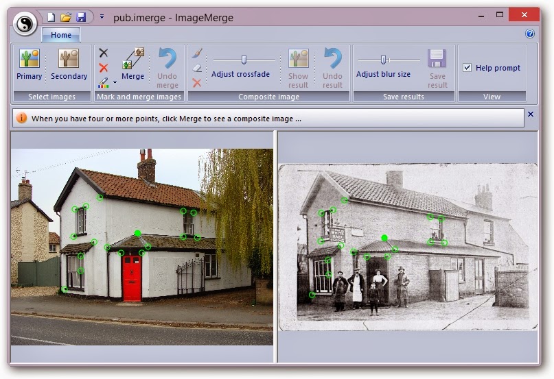
You can pan and zoom each image and can adjust the vertical splitter bar to adjust how much of each image you see. Use the mouse scroll-wheel to zoom in or out and just click and drag with the left mouse button to pan the images. Each image can be panned/zoomed independently.
The next step is to mark a number of reference points on each image so that they can be correctly registered. Moving on …
Mark and merge
On either of the images, find a suitable reference point, such as a corner of a door or window frame, that you will be able to locate fairly accurately on the other image. Zoom in to get more accuracy and then right-click once with the mouse to mark a green spot at that location.
As you do so, a corresponding marker will be added to the other image in an approximately similar position. It’s not always easy to see, so you may need to zoom in or out to find it.
When you’ve found the marker that was added to the other image, left-click and drag on the marker itself to move it to the exact position that corresponds to the reference point you chose in the first image. Get it?
Repeat this process until you have a reasonable number of marker pairs that are arranged over significant parts of the image. For example ...

If you left-click on a marker in one image, it turns to solid green and the corresponding marker in the other image also turns solid so you can see which ones match.
If you have clicked a marker, you can use the Remove option from the ribbon to delete that marker pair from both images, or you can click Clear to remove all markers if you want to start again, and if the green colour is not visible enough, you can select a different colour using the Colour option.
Note that it's important that the marker points should identify medium-to-large, flat, two-dimensional areas, such as walls, doors, windows, signposts, etc. and should not all be in a single line. If they are, or if you don't have enough points, the next step might look a bit weird. No, it will look a bit weird ....
So, when you have marked at least 4 points (but ideally 7 to 10 - the more the merrier), click the Merge button on the ribbon to move to the next step...
The composite image ...
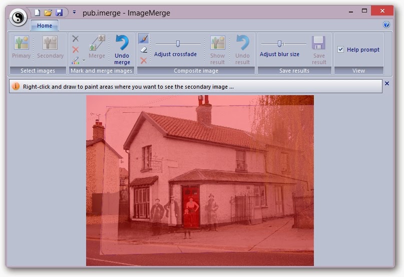
If everything went ok, you should see a composite image with a nice pink glow. This will be the primary image but with the secondary image – correctly positioned and sized – showing as a cross-faded ghost.
If this is not happening, in other words, it does look weird, then as I said above, you probably didn’t choose enough good marker pairs in the previous step. In which case, click Undo Merge to return to the previous step and either adjust your marker positions or add some additional ones to get a better registration.
Using the images above, the following screenshot shows the sort of thing to expect. You can see that the primary image is unchanged (apart from looking pink!) but that the secondary image has been distorted – technically, it’s undergone a perspective warp – and scaled (stretched or shrunk) so that the reference points you marked are as near as possible coincident with those in the primary image. Use the Adjust crossfade slider to fade between the two images to check the registration ...

Now what you do, is to right-click and drag with the mouse to “paint” the areas of the composite image where you want the secondary image to show through.
These areas will be shown in green as in the example below ...
To paint finer detail, just zoom in before painting – the size of the paintbrush doesn’t change, so the thickness of the brush depends on your zoom level. This is much easier (in my humble opinion) than having to select a particular brush size.
If you mistakenly paint some green areas where you didn’t want to, click the Erase button on the ribbon and then right-click and paint again to return to the pink colour. Click Paint to get back to normal.
After you’ve finished painting the areas you want merged, click Show Result ….
Nearly done ...
At this stage, the primary image will be merged with the
warped secondary image in those places you have painted. It should look ok, but maybe not perfect.
By default, the areas
will be blurred so that there is a smoother transition, which makes it easier
on the eye if the images are not similar colours (as in the above example). This means you might want to paint bigger areas and let the blur fade nicely...
... alternatively, use the slider on the ribbon to adjust the blur radius until you get the visual effect you want. If you mess up, just click Undo Result to return to the previous step and adjust your painted areas.
When you are finally happy, click Save Result to save the final image. Note that you must click the large Save Result button on the ribbon – this is different to the small save at the top left, which saves details of the image filenames, marker positions and painted areas, so you can quickly load a marked and painted pair for editing later.
Ok, enough typing – get playing and see what happens. You have already seen one of my ideas – current and historic photos - but you can also experiment with identical scenes but with different people (
I'll post some of my triplets later!), or maybe the same scene at different times of the day, or different times of the year, etc.
See what you think ..... it kept me amused ....


